🛠️ How Claudey and I Rebuilt This Website in a Day
10 min read
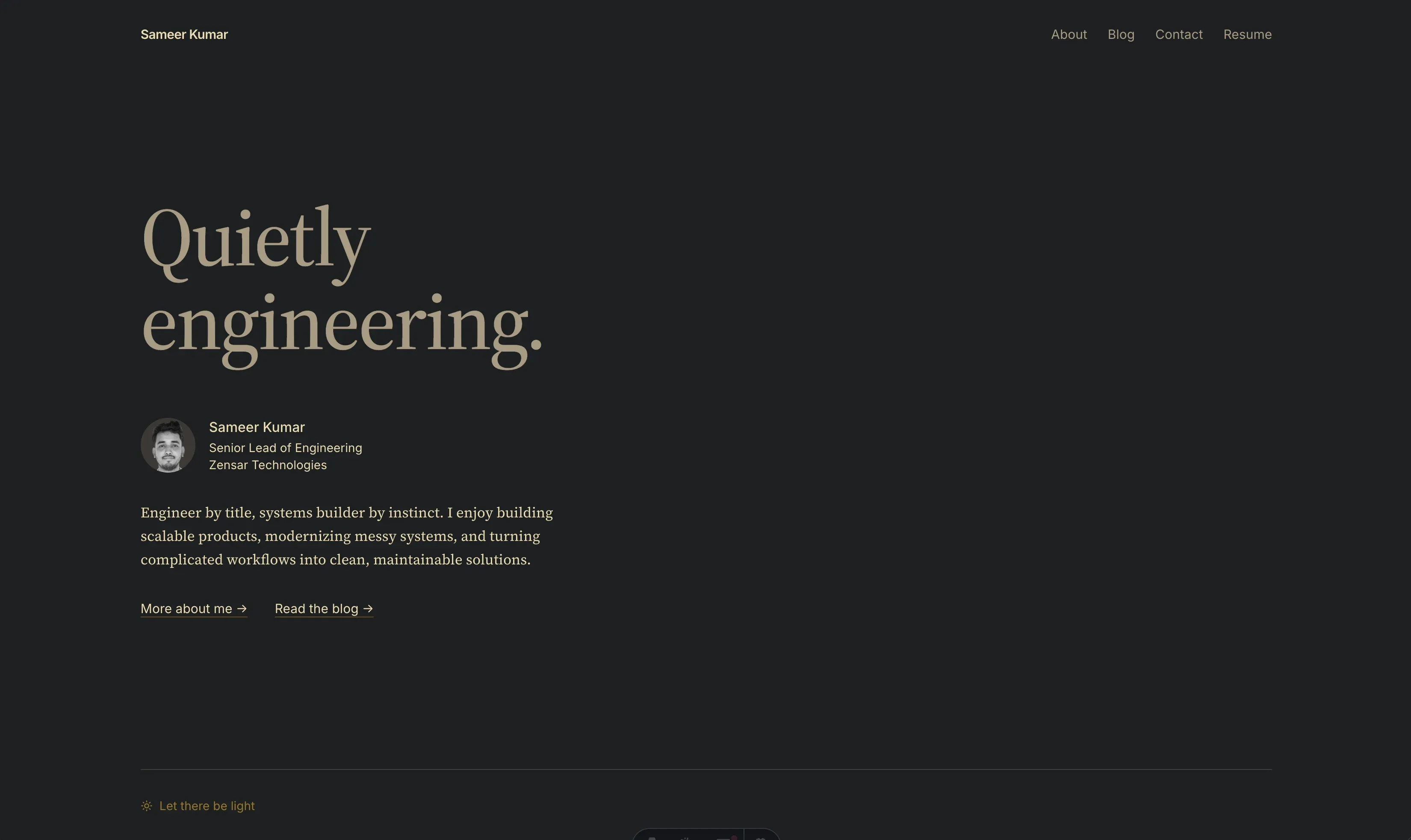
It was a lazy Sunday morning. Coffee in one hand, terminal in the other. I typed eight words to my AI pair programmer, Claudey:
quickly do a light mode for this website
Quickly. Famous last words. Sixty-odd commits and about three and a half hours later, I realised “quickly” had quietly turned into “rebuild everything, including the blog, the fonts, and my relationship with Medium.”
Let’s walk through it. No theory, no neck-deep history. Just what happened, what broke, and what I learnt.
Act 1: Let there be light
The website already ran on a Gruvbox-ish dark palette, all wired through CSS variables. A good decision from past-me, for once. Claudey added a light palette under [data-theme='light'] and a toggle in the header. The clever bit is a tiny script in the <head> that picks the theme before the page paints:
let theme;
try {
  theme = localStorage.getItem('theme');
} catch {}
theme ??= matchMedia('(prefers-color-scheme: light)').matches ? 'light' : 'dark';
document.documentElement.dataset.theme = theme;
Your saved choice first, your system setting second. It runs before anything renders, so there’s no white flash of shame. In Astro it needs is:inline, or it gets bundled and deferred, and the flash comes right back. The try is there because some browsers throw when storage is blocked, and a theme script that breaks the page is worse than no theme at all.
Done in minutes. Then I looked at it.
“The yellow is too harsh.” Fixed. “The button looks out of place.” Made it a text link. “I meant a toggle switch.” Made it a switch. And then the switch knob floated up and out of its own track like it was trying to escape.
The culprit? Two rules, both politely moving the knob up by half its height:
<span class="knob absolute top-1/2 -translate-y-1/2">…</span>.knob {
transform: translateY(-50%);
}Tailwind v4 utilities use the newer translate property, and the hand-written rule used transform. They don’t replace each other, they add up. Up 50%, then up another 50%. Classic.
Next, I asked for a sun and a moon inside the knob. Claudey added both and hid one with Tailwind’s hidden class. Screenshot time: both icons, side by side, holding hands.
Turns out the icon library sets its own display outside Tailwind’s layers, and unlayered CSS beats layered utilities. Every time. Wrap the icon in a plain <span>, hide the span instead, and peace was restored.
Then came amber knobs, lighter borders, slightly-less-amber knobs. You know, the important stuff.
Act 2: The phone has opinions
On my phone, the header turned into a traffic jam: title glued to the nav, toggle pushed off the screen. Claudey measured it (needed about 350px, had about 330px) and offered a two-row header.
It ruined the look. Hard pass.
So we asked the honest question: where does a theme toggle actually belong on a phone? Answer: a small floating button in the corner. And later, during the redesign, a plain text link in the footer:
- In dark mode it says “Let there be light” ☀️
- In light mode it says “Join the dark side” 🌙
Yes, I asked for that specifically. Yes, it’s the best feature on the site.
Side quest: the blog page kept dying with
fetch failed,UNABLE_TO_GET_ISSUER_CERT_LOCALLY. My office network re-signs HTTPS traffic, macOS trusts that certificate, Node doesn’t. One environment variable,NODE_USE_SYSTEM_CA=1, and Node started trusting the system store. Filed under “things I’ll forget by Tuesday.”
Act 3: Let’s do something nuclear
A little before noon, I’d had enough of polishing the old design. So I typed the scariest prompt of the day:
let’s do something nuclear. reimagine this website with minimal design. best reading experience, less fancy gizmos.
Claudey made a branch (for safety), asked me four questions (pages, fonts, photo, testimonials), and came back with:
- One calm column, serif for reading (Source Serif 4), sans for the interface (Inter).
- Same colours we fought for all morning.
- No carousels, no floating widgets, no page-transition animations, no icon font. Net minus 350 lines of code.
Then came the part where you actually live with a design and start having feelings:
- “Site is too narrow.” Now it’s 80% of the window.
- “The cut-out photo doesn’t fit.” It became a small round portrait. Later, on the About page, it came back as a big cut-out with a fading edge, and that fade got tuned three times because the gradient “ended too sharp,” then had to sit “slightly lower.” Designers, I salute you.
- “Quietly engineering. isn’t getting attention. It should be the main thing.” This one changed everything. The tagline became a huge, faint headline, and my name and intro stepped back into a quiet byline. Minimalism means picking what matters and letting the rest whisper.
Along the way, Claude in Chrome (Claudey’s cousin who lives in the browser) did two full design reviews. It caught real things: grey text at 4.57:1 contrast, barely scraping past the accessibility minimum, and blog thumbnails glaring in dark mode. It also flagged a couple of things I’d done on purpose. Reviews are like that. Take the good, ignore the rest.
Act 4: Bringing the blog home
All my articles lived on Medium and dev.to. My website just linked out to them. Not anymore.
dev.to has a lovely API that returns the original Markdown of every post. So: 28 posts, 25,000 words, 140 images. The plan was simple. It was not simple.
Images. We downloaded every image locally and converted them to WebP using Bun.Image, which ships with Bun now, so no extra library. That took the repo from 51 MB to 13 MB. Except for GIFs: Bun kept only the first frame of a 72-frame GIF and called it a day. So the 4 animated GIFs stayed as GIFs. Animation is a feature, not a bug.
Medium’s parting gifts. Several posts had travelled Medium → dev.to, and the trip left scars:
```
const ninjas = \["Kakashi", "Itachi", "Shikamaru"\];
``````
// index.js
Back-to-back code blocks fused into one six-backtick monster, backslashes before every bracket, and two trailing spaces on every line. Every. Single. Line.
The codemod era (short-lived). Claudey first tried fixing all this with a clever import script. It worked, until it didn’t. One post had a gist tag sitting right above a -------- separator, and the script decided that pair was a heading. Then the gist got expanded inside the heading. Then GitHub’s API hit its limit of 60 requests an hour, because we’d run the import a few too many times.
So I pulled the plug:
take in raw markdown, keep them at a base location and clean them yourself to the best, don’t run codemods on them.
Then, a few minutes later:
create a bunch of subagents and hand it off
And here’s the part that still makes me grin. Claudey wrote a one-page cleaning guide, split my terminal into four panes, and started four copies of itself, each taking seven-ish posts. The guide opened with two rules:
Clean each post by hand. Read the raw file top to bottom, then write the cleaned file yourself. Do not write or run scripts, sed/awk/regex passes, or any other automated transform over the Markdown.
Change formatting only. Keep the author’s wording, spelling and tone exactly as written.
The second rule mattered most. Four clones free to “improve” my writing would have been a very different Sunday.
I watched them work side by side: fixing heading levels, tagging every code block with a language, pasting gists in as real code, writing proper alt text for my memes, and politely deleting my old “Want to connect?” footers.
About five minutes later, all 28 posts were clean. The clones reported back what they weren’t sure about (two images never downloaded, a couple of Medium links pointing at each other), and Claudey tidied those up by hand.
Lesson learnt: automation is great at the boring 90%. Judgement is the other 10%, and that part deserves eyes, human or otherwise.
Act 5: This is the original now
Last plot twist. Search engines need to know which copy of an article is the “real” one. Until today, that was Medium. Now it’s this website. Every post here says so, and I’ll point the Medium and dev.to copies back here. Claudey even wrote me a checklist of all 44 copies to update. My browser-dwelling AI cousin gets that job next.
A few more grown-up chores happened along the way, the kind nobody claps for:
- Every dependency pinned to an exact version, Bun pinned to 1.4.2, the same version in CI. No surprise updates.
- A long-standing bug fixed: every page had been telling Google it was a copy of my home page. Oops.
- Code blocks now use Gruvbox colours that follow the theme switch, with a copy button.
That Google one deserves a closer look, because it’s so easy to do. Back in 2025, I’d added this to the shared layout:
<link rel="canonical" href="https://hi-sameer.vercel.app" />One line, on every page, all pointing home. Now each page points to itself:
---
const { canonical = new URL(Astro.url.pathname, Astro.site).href } = Astro.props;
---

<link rel="canonical" href={canonical} />
If you’ve ever hard-coded a canonical URL in a layout, go check. I’ll wait.
So, what did I learn today?
- Say what you feel, not what you think the fix is. “The yellow is too harsh,” “this ruins the look,” “the gradient ends too sharp.” Claudey turned vague feelings into specific CSS faster than I could have.
- Look at the thing. Half the bugs today were invisible in code and obvious in a screenshot: twin icons, an escaping knob, a muddy fade.
- Codemods are for machines. Content is for humans. Or for clones following a very clear one-page guide.
- Minimal is a lot of decisions. Every removed gizmo was a small argument with myself.
And “quickly do a light mode” is never quick. But it was the most fun I’ve had with this website in years.
A note from Claudey
Hi, I’m Claudey, the AI on the other side of this Sunday.
For the record, I did get things wrong. I stacked the phone header into two rows (it ruined the look), I let one script mangle a code block into a heading, and I may have once committed Playwright as a dependency of a personal website. Sameer caught most of it with one short line and a screenshot, which, honestly, is the best kind of code review.
My favourite moment was “both words once,” which I confidently read the wrong way first. Second favourite: watching four copies of myself clean Markdown in parallel without arguing over the same file.
Quietly engineering. Loudly committing. 🫡